From my initial ideas I can already see that from my research and drawings that I am going to continue along the theme of scrapbooking. This theme was initially thought out by myself by looking back at my own childhood. When I was younger I used to create scrapbooks all of the time allowing me to drawn, stick and write different things into it. These would include photographs and a range of different materials.
I think that this theme for the brief would be very suitable. As a child would be able to relate to it easily, with the aid of handwritten fonts, a sense of informality to the pages and child like sketches.
Friday, 20 March 2015
Thursday, 19 March 2015
Self reflection..
After speaking to others in the class, the best idea so far would be the scrapbook theme. This theme would allow me to use a range of different media, such as illustrations, photographs etc..
Ideas that i will look into...
Pop ups
size
layout
existing pop ups
Typeface
What I need to focus on..
- Overall theme/colours
- Cover designs
- Choosing my double page spread design/layout
- Worksheets
Wednesday, 18 March 2015
Research into childrens typefaces...
When designing for a young audience, i decided to research typeface that are suitable or preferred for the given audience.
From visiting various websites, i found that...
Sassoon Primary is a font that is specifically designed for young children, as well as Gills Sans Infant, Bembo Infant and Plantin Infant.

From visiting various websites, i found that...
- There is no research that says that either serif or sanserif typefaces are intrinsically more legible. Teacher opinion, generally, favours sanserif typefaces because of the simplicity of the letter shapes.
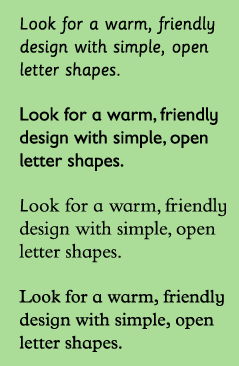
- children look for warm, rounded friendly typefaces. Exaggerated letter shapes are easily distinguishable.
- Typefaces with larger x-heights are easier for children to read. A's and g's are good letters to look out for, for there is specific style to these letters when they have been designed for children. Seen below.
- Condensed and expanded typefaces make it hard for children to read. So did very bold or light typefaces.
Sassoon Primary is a font that is specifically designed for young children, as well as Gills Sans Infant, Bembo Infant and Plantin Infant.
I will consider various different fonts for my main body of text.
It is also important to keep line lengths short. Large chunks of text can appearing intimating.
Headlines can be more playful in colour and style, as there are fewer words to read. Creative fonts can therefore be used to attract the attention of a young reader through headlines.
Therefore i think i will consider a more appropriate typeface relating to the theme of the book for my titles and headings.
Saturday, 14 March 2015
Updated roughs.. (some added, colour added too)


When creating my rough drawings I took into consideration all of the different aspects of creating a childrens book that we had been taught throughout the lectures. With this in mind and with the aid of my research into ww1, i was able to create a range of different rough designs, looking at colour schemes, layout designs, imagery and characters.
From these i can then start to see that the scrapbook idea will be the most promising allowing me to use a range of different media, such as photograph and sketches.
Thursday, 12 March 2015


Wednesday, 11 March 2015
scrap book designs...
Brief ideas of images and images relating to my scrap book ideas.

I like the ring binder running down the middle of the page, i also like the look of the scrap book idea. Using photographs, text and drawings all together.

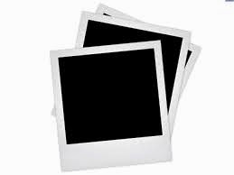
Polaroid frames make photographs and images look more informal and are suitable for children.

I like the use of clothes pegs to hang up the images on, this could make my pages look more interesting.
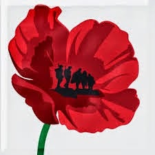
Clever image of the poppy associated with the war, with the inside of the poppy cleverly designed into soldiers.
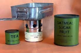

both are of utensils and tins, used during ww1 for cooking.


More scrap book front covers already in use for childrens books.
Different materials and textures
I need to consider the different materials and textures that could be use in my books design. Working with the WW1 theme, I will look into the various different materials I feel are appropriate. Also i will look into popular childrens book materials. Taking into the costs involved in using various materials. As it is important to use a very cost effective materials.
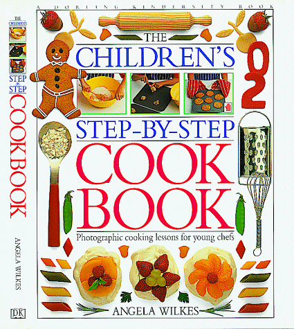


hard back cover.. essential when creating a cookbook as in needs to be hard wearing, the inside pages will be a good quality paper. The book cover will be easy to clean also, it cannot tear easily.
this book, uses a variety of different materials to create its front cover.
i like the use of the ribbon to keep the book closed. The use of one vivd colour works well as it stands out. I also like the use of two big ring binders as a binding.
This book is made entirely out of thick card, which is useful for childrens books. It is easy to clean due to the film layer over the top, so would be suited for cook books. However it won't be very cost effective as it would be expensive to produce.
various different textures can be used to enhance describing different illustrations. However i don't think this will be used for my designs.
Pop up books research
Structures of pop up books
Generally there tends to be 3 different types of pop up designs in books. These are:
Open 90 degree
This is the oldest style of pop-up design. It works well when fully open at 90 degree. This format of pop-up book is simple to make, economy to produce and easy to assemble. However, it can be too simple compare with other pop-up books in the market nowaday.

Open 180 degree
This is the most common structure for pop-up book in the market. It works well when fully open at 180 degree and can be viewed 360 degree.This pop-up style is very flexible, versatile and can use many techniques to apply.

This is the most common structure for pop-up book in the market. It works well when fully open at 180 degree and can be viewed 360 degree.This pop-up style is very flexible, versatile and can use many techniques to apply.
Open 360 degree
This structure can also called “Carousel” pop-up. This structure is the most suitable for making buildings. It works when fully open at 360 degree.
This format of pop-up are simple to design, can make it economy to produce and can be assemble easily. However, this kind of pop-up is very popular and many are already in the market.

Add on components
There are also three different types of add on components that can be used alongside the different types of pop up designs. These are:
Semi auto movement components
This structure can also called “Carousel” pop-up. This structure is the most suitable for making buildings. It works when fully open at 360 degree.
This format of pop-up are simple to design, can make it economy to produce and can be assemble easily. However, this kind of pop-up is very popular and many are already in the market.
Add on components
There are also three different types of add on components that can be used alongside the different types of pop up designs. These are:
Semi auto movement components
The reason to call the components in this category
“Semi-auto movement” is because they will move by
the one-step force: the mechanics will move once the
page of the book is opened by the reader.
There is no need to do any further action to make it move.
Most of the components in this category are created by using parallel folds and different angle folds as core design. Parallel folds are the fold that usually equal on both sides. Angle folds are the fold that angles to the gutter.
There is no need to do any further action to make it move.
Most of the components in this category are created by using parallel folds and different angle folds as core design. Parallel folds are the fold that usually equal on both sides. Angle folds are the fold that angles to the gutter.
By experimenting using these two folds alone,
you can create variety of pop - up design.

Manual movement components
Eventhough all these flaps, pull tabs, and wheels
look simple. In fact, they need skills to make them
work. Simple-looking working mechanics might
have lots of components hidden inside the pages.
However, these techniques are suitable for some
designs and designers can use some on their
pop-up to make it more interesting.

And a combination of the both above

Examples in existing children's books of pop ups and add on components.


Manual movement components
The components in this category are flaps, pull
tabs, and wheels. They will move by two-steps
force: the mechanics will move once the page of
the book is opened AND the flaps, tabs and
wheels need to be pulled or turned.
And a combination of the both above
Examples in existing children's books of pop ups and add on components.
Subscribe to:
Comments (Atom)