From visiting various websites, i found that...
- There is no research that says that either serif or sanserif typefaces are intrinsically more legible. Teacher opinion, generally, favours sanserif typefaces because of the simplicity of the letter shapes.
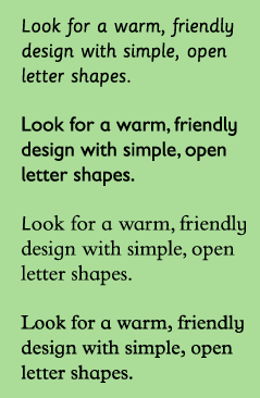
- children look for warm, rounded friendly typefaces. Exaggerated letter shapes are easily distinguishable.
- Typefaces with larger x-heights are easier for children to read. A's and g's are good letters to look out for, for there is specific style to these letters when they have been designed for children. Seen below.
- Condensed and expanded typefaces make it hard for children to read. So did very bold or light typefaces.
Sassoon Primary is a font that is specifically designed for young children, as well as Gills Sans Infant, Bembo Infant and Plantin Infant.
I will consider various different fonts for my main body of text.
It is also important to keep line lengths short. Large chunks of text can appearing intimating.
Headlines can be more playful in colour and style, as there are fewer words to read. Creative fonts can therefore be used to attract the attention of a young reader through headlines.
Therefore i think i will consider a more appropriate typeface relating to the theme of the book for my titles and headings.
No comments:
Post a Comment