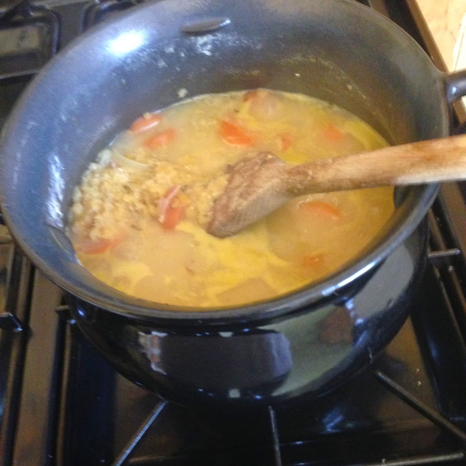
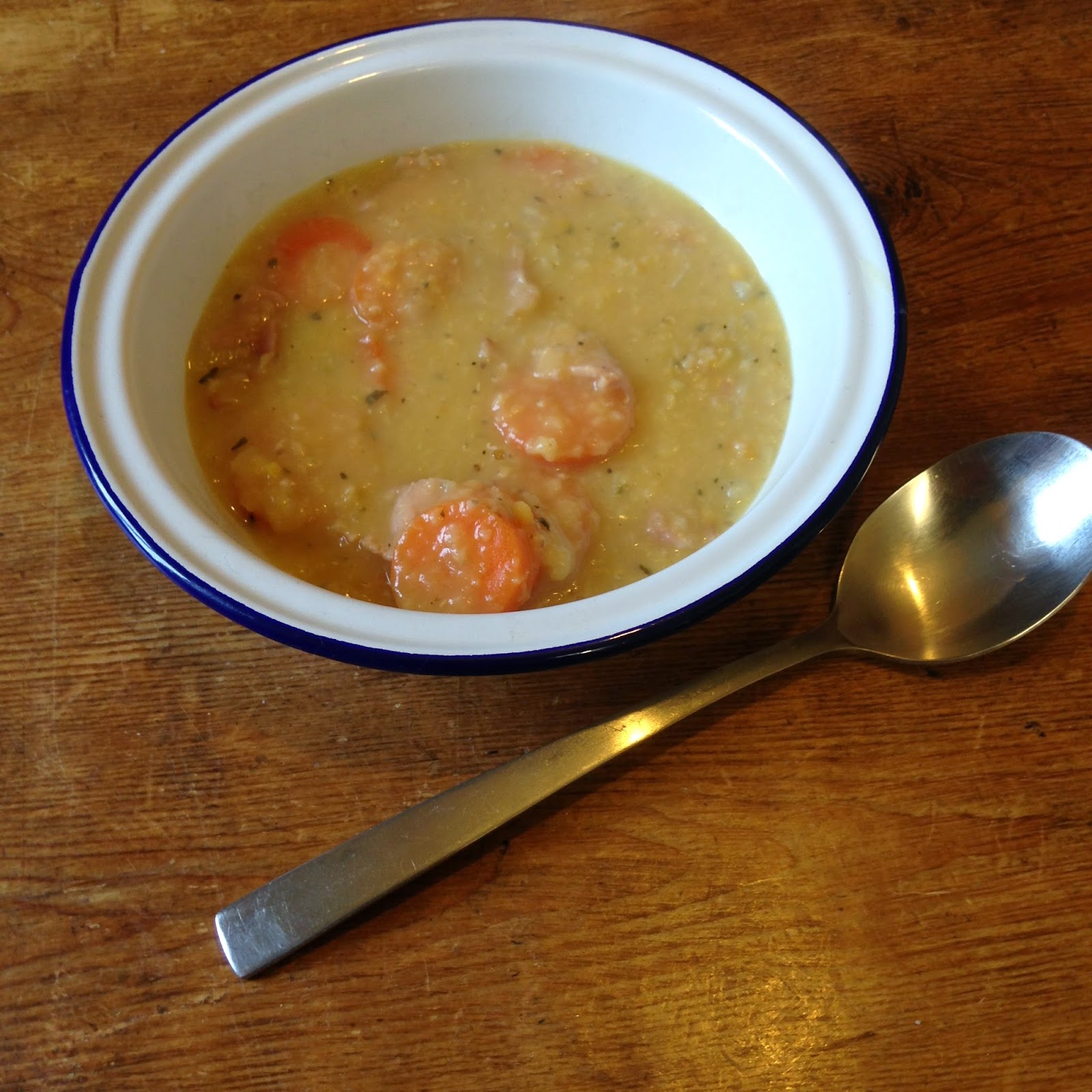
I decided to cook the lentil hot pot as one of the recipes for my double page spreads. Using props found in my kitchen to try and recreate images that look similar to those of WW1. These photographs will become very useful when designing my spreads on screen, as they will allow me to add different forms of media to my final pieces, aiding me to create the scrapbook feel.
Saturday, 4 April 2015
Photographs from Eggless Sponge recipe unedited
I decided to cook the eggless sponge as one of the recipes for my double page spreads. Using props found in my kitchen to try and recreate images that look similar to those of WW1. These photographs will become very useful when designing my spreads on screen, as they will allow me to add different forms of media to my final pieces, aiding me to create the scrapbook feel.
Friday, 3 April 2015
Choosing a title...
When creating my children WW1 cookery book. I came up with a variety of different concepts along with many different titles for the book.
My title ideas were as follows...
Rations and rashers
Children of the home front
Ration book recipes for children
The kitchen front
I asked various friends and family their opinions on the titles that i had created, overall the title.. Children on the homefront cookbook was the chosen title.
I personally i feel that this was the better title from the ones that i had come up with, i feel that it has the best sound to it and is simple.
My title ideas were as follows...
Rations and rashers
Children of the home front
Ration book recipes for children
The kitchen front
I asked various friends and family their opinions on the titles that i had created, overall the title.. Children on the homefront cookbook was the chosen title.
I personally i feel that this was the better title from the ones that i had come up with, i feel that it has the best sound to it and is simple.
Friday, 20 March 2015
Self reflection..
From my initial ideas I can already see that from my research and drawings that I am going to continue along the theme of scrapbooking. This theme was initially thought out by myself by looking back at my own childhood. When I was younger I used to create scrapbooks all of the time allowing me to drawn, stick and write different things into it. These would include photographs and a range of different materials.
I think that this theme for the brief would be very suitable. As a child would be able to relate to it easily, with the aid of handwritten fonts, a sense of informality to the pages and child like sketches.
Thursday, 19 March 2015
Self reflection..
After speaking to others in the class, the best idea so far would be the scrapbook theme. This theme would allow me to use a range of different media, such as illustrations, photographs etc..
Ideas that i will look into...
Pop ups
size
layout
existing pop ups
Typeface
What I need to focus on..
- Overall theme/colours
- Cover designs
- Choosing my double page spread design/layout
- Worksheets
Wednesday, 18 March 2015
Research into childrens typefaces...
When designing for a young audience, i decided to research typeface that are suitable or preferred for the given audience.
From visiting various websites, i found that...
Sassoon Primary is a font that is specifically designed for young children, as well as Gills Sans Infant, Bembo Infant and Plantin Infant.
From visiting various websites, i found that...
- There is no research that says that either serif or sanserif typefaces are intrinsically more legible. Teacher opinion, generally, favours sanserif typefaces because of the simplicity of the letter shapes.
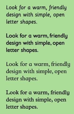
- children look for warm, rounded friendly typefaces. Exaggerated letter shapes are easily distinguishable.
- Typefaces with larger x-heights are easier for children to read. A's and g's are good letters to look out for, for there is specific style to these letters when they have been designed for children. Seen below.
- Condensed and expanded typefaces make it hard for children to read. So did very bold or light typefaces.
Sassoon Primary is a font that is specifically designed for young children, as well as Gills Sans Infant, Bembo Infant and Plantin Infant.
I will consider various different fonts for my main body of text.
It is also important to keep line lengths short. Large chunks of text can appearing intimating.
Headlines can be more playful in colour and style, as there are fewer words to read. Creative fonts can therefore be used to attract the attention of a young reader through headlines.
Therefore i think i will consider a more appropriate typeface relating to the theme of the book for my titles and headings.
Saturday, 14 March 2015
Updated roughs.. (some added, colour added too)
When creating my rough drawings I took into consideration all of the different aspects of creating a childrens book that we had been taught throughout the lectures. With this in mind and with the aid of my research into ww1, i was able to create a range of different rough designs, looking at colour schemes, layout designs, imagery and characters.
From these i can then start to see that the scrapbook idea will be the most promising allowing me to use a range of different media, such as photograph and sketches.
Subscribe to:
Posts (Atom)